
Tucked away in
Corbridge
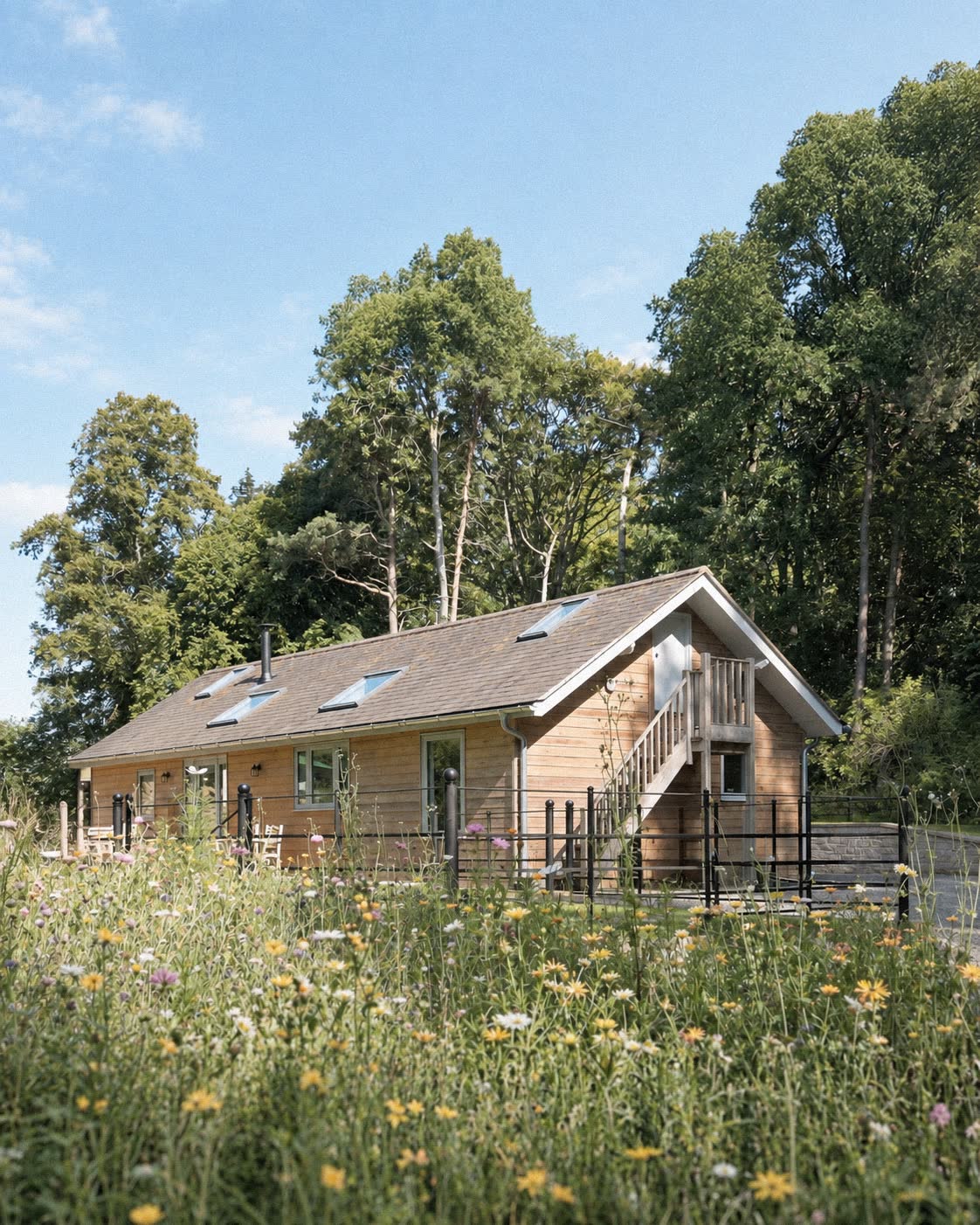
— Design
Everything
considered.
A former family workshop, now a quiet place to stay among the trees.
A better
place
to land
Architectural photography
selected for the RIBA
Collections · 2026
01 The magazine treatment
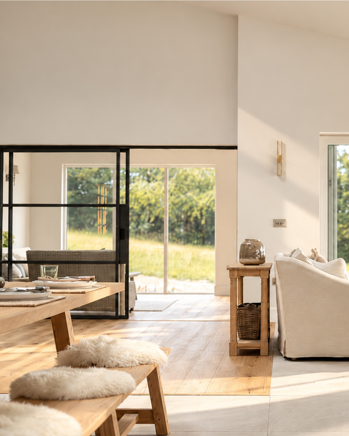
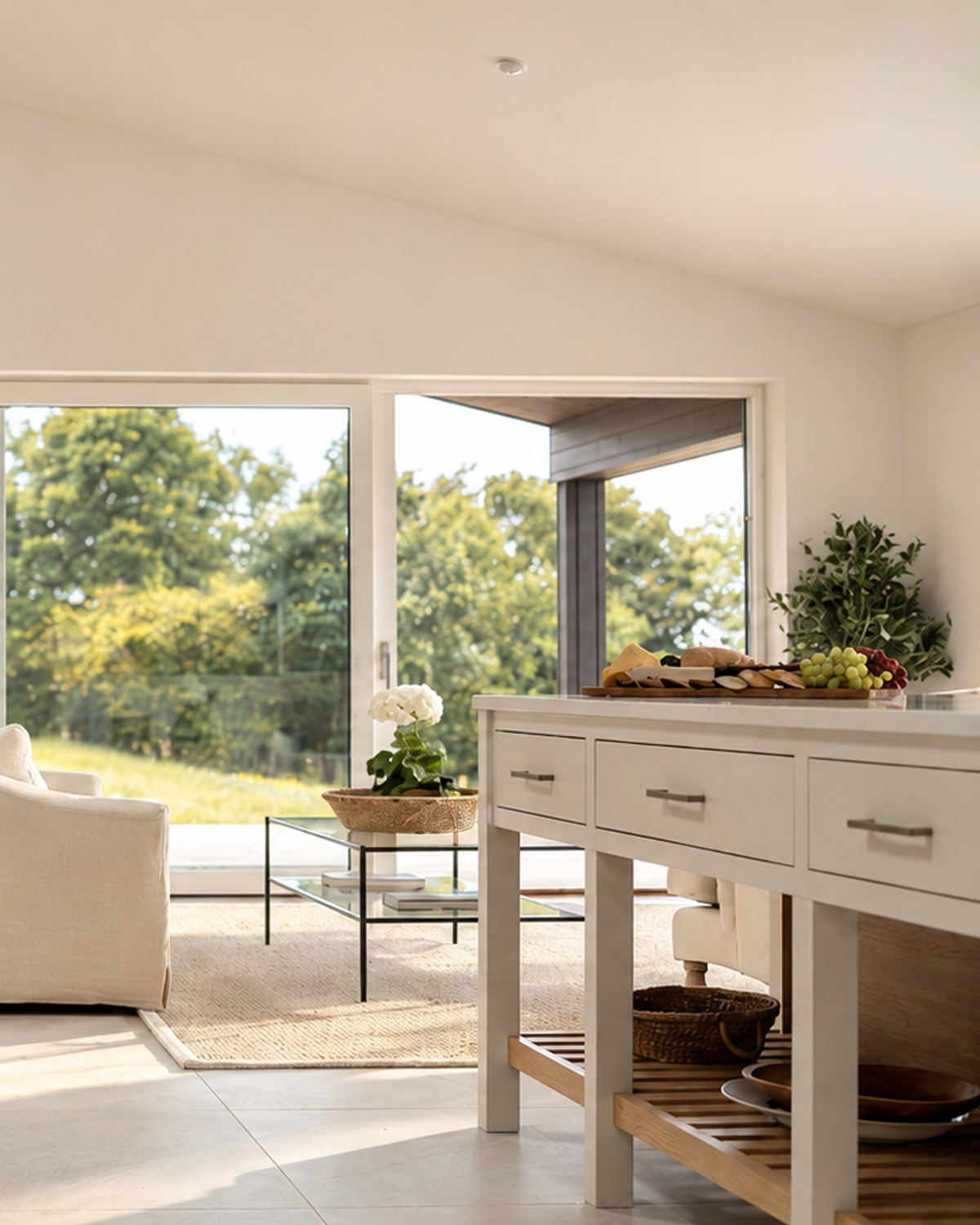
Each website is composed around the character of your place. I bring the photography, film, words and design together myself, working with what you already have and creating what’s missing.
The result is somewhere worth exploring, a reason to stay and a simple way to enquire or book.
02 The Old Workshop
— Design
A former family workshop, now a quiet place to stay among the trees.
Individually composed for mobile, tablet and desktop. Photography, copy and pacing are reconsidered for each screen, rather than simply scaled, so the atmosphere holds everywhere.
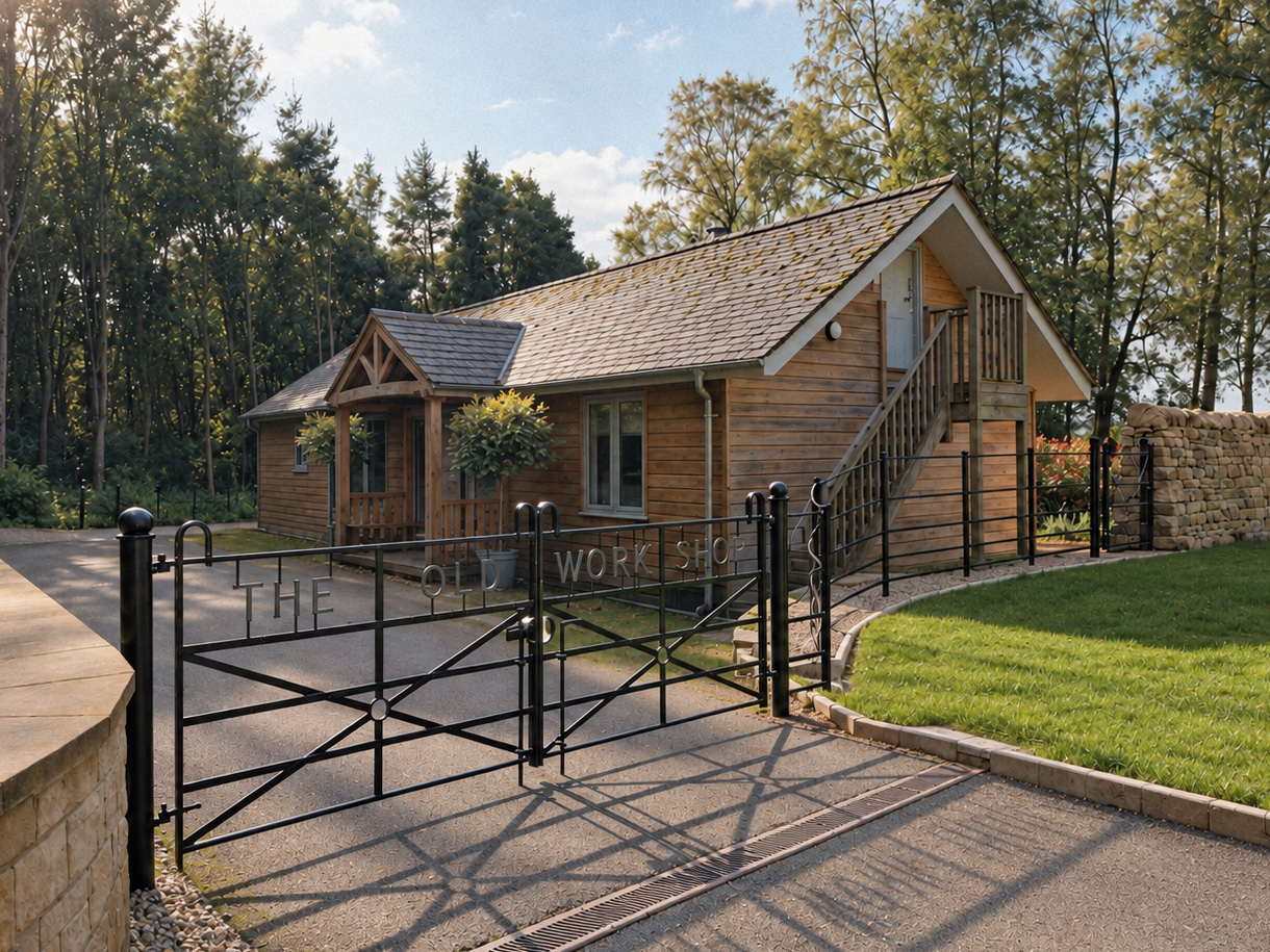
Photography, film and website for a Northumberland stay.
View website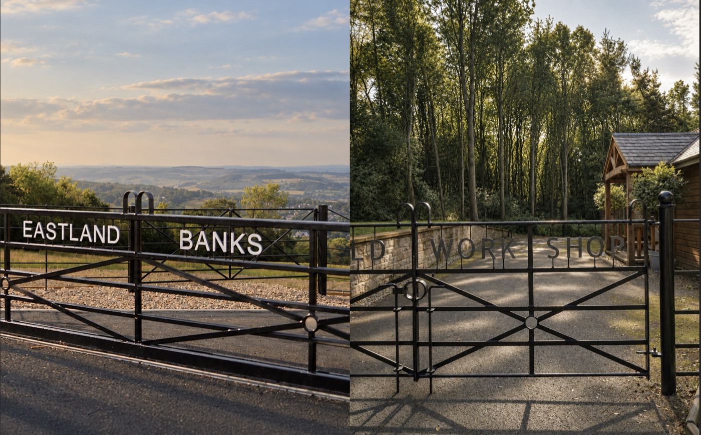
A property development website, bringing the places and their stories together.
I’m Jon Lindsay.
Filmmaker-first, developer by choice.
I design and build the websites as well as creating the imagery, so the care taken in making the work carries through to how people experience it.
You work directly with me, from the first conversation onwards.
Fast loading and straightforward navigation make the site easy to use. I take care of ongoing hosting, security and updates, with a clear care plan agreed before launch.
Let’s talk
Tell me about your place and what you need. I’ll put together a clear proposal covering the work, cost, timing and ongoing care.
[email protected]